 Lettershape
Desktop and mobile previews
Check how your email looks on a phone.
Switch between desktop and mobile previews to spot crowded buttons, long headings, and awkward spacing before you download your email.
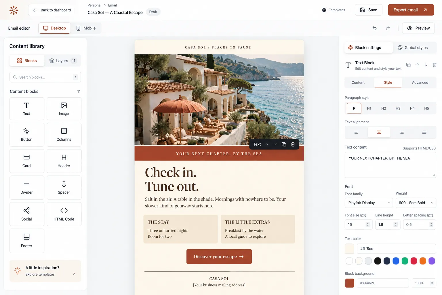
Catch layout problems while you edit.
Switch between a 600-pixel desktop view and a 375-pixel phone view. Check whether headings fit, buttons have enough room, and images leave space for the message. Columns stack in the phone view so you can read the email from top to bottom.
Keep the message readable without images.
Some inboxes hide images until the reader allows them. Keep offers, dates, and other essential details in the text of your email. Give buttons clear labels, such as View the menu or Book a place.
Download a layout that adjusts to screen width.
The exported email includes rules for resizing images and stacking columns on narrow screens. It also includes backup fonts for inboxes that cannot load your chosen font. Email apps handle these rules differently, so send yourself a test through the tool you plan to use.
Frequently asked questions
Before you create an account
Does the preview show exactly how an inbox will look?
No. It shows your layout at two widths in a browser. Gmail, Outlook, and other email apps can display it differently. Check a test email in the apps your readers use.
Are custom fonts supported?
You can choose a font in Global Styles. Inboxes that support that font can display it; other inboxes use a backup font included in the export.
Start with the Free plan
Create and download
your first email for free.
Create an account, verify your email address, and choose a template to edit.
Create a free accountSave up to 3 designs. No credit card required.